


Renée's former brand didn't feel how she always envisioned it would. It wasn't bad...it just wasn't what she wanted.
She wanted dark and unnerving. Haunting. But she was torn. "I would love something that has a Nosferatu vibe, but I would also LOVE something that has a haunted 80s vibe."
This rebrand was even more important because she had big goals for growth.
1. Expand her product line from beard products to body care. Which meant that her customer base would be expanding from bearded faces to bodies of all kinds.
2. Create a brand that would be welcomed in both oddities expos and horror conventions.
3. Get accepted into retail shops and for licensing agreements with horror films.
the goals


.png)
.png)


.png)
.png)
.png)

.png)
.png)
.png)
.png)

static shadows
The light flickers. Colors stretch and everything takes on a hazy glow. The shadows have claws and teeth. So, you run. Through streets and empty alleyways, bursting through the heavy wooden doors of a gothic cathedral. Only, you find yourself standing back in your living room. A couch. A TV. The blue glow of static looping endlessly. Neon lights humming in the silence.


As Black Manor Grooming expands its product collection, the challenge became creating a distinctive label system for each of the two lines without sacrificing brand recognition.
While both collections share the same visual foundation, each line was given its own personality through color, contrast, and theme.
2-part Label System
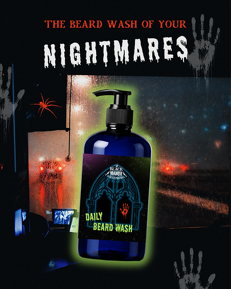
For the core collection, I leaned into the brand's signature horror aesthetic through bold color, neon-inspired glow treatments, and illustrative elements that feel cinematic and collectible.
The Ghost Line is created to "disappear without a trace" so I designed a haunting, almost phantom-like presence. The color palette was simplified to black, white, and spectral blue, creating a colder, more ethereal feel while maintaining the same illustration style and overall brand architecture.
.png)
.png)
%20(3).png)
%20-%205_75%20x%202_5%20(5_825%20x%202_575%20in).png)


before

after
I wanted the website to truly embody the brand. With movement, texture, and glowing details.
Shopping on the website should feel like stepping into the Black Manor Grooming world - creatures lurking from the shadows, static TVs, and gothic unease.

Here's what she had to say about it:


product photo templates
Templates were created to cut the stress of product photoshoots and ensure her website is always on brand.
.png)
.png)
.png)

.png)
bringing the brand to life
An art print is included with every order to make the unboxing experience feel like entering her world.
.png)
We wanted a brand that can be experienced across every touchpoint.
Social media templates ensure her Instagram feed is always on-brand.

.png)
A small Image Gallery was included in her package - each image carefully chosen and edited to represent the Black Manor Grooming Brand.
Her Lifestyle Guide was full of ideas for content and even booth decor for vendor events.
.png)

licensed collab
Renée asked me to create labels for her first licensed collab with a horror movie: Terror Film's Hell House LLC.


I wanted it to feel like something that would exist in both worlds...with her brand's sketchy illustrations and the iconic Hell House LLC hotel and color scheme.
She came back for a second design for the same movie. This one features a ghostly girl with a haunting expression.
.png)

.png)
