


Oblivion Tattoo Studio came to me because their logo looked like every other tattoo studio’s logo and nothing like the brand they envisioned. They wanted gothic architecture meets dark folklore, with inspirations ranging from Robert Eggers' Nosferatu and The Addams Family, to art nouveau and Pan's Labyrinth.
Vala & Joel said, "We opened our studio in a rush in 2021 and because of that our logo is so not us." They wanted me to create a full brand identity that matched their vibe. So, I did.

.png)
.png)
.png)
.png)
.png)
.png)
.png)
.png)
.png)
.png)
.png)
.png)

Between unseen worlds
Oblivion Tattoo Studio is the crossing point between the mundane world and the unseen worlds of self-expression, history, and folklore.
When a client steps through the door, they aren’t just entering a tattoo studio, they’re crossing a boundary into a place where the forgotten, the hidden, and the magical coexist.
Each tattoo is a symbol marking the moment between who their clients were and who they are becoming.
Oblivion exists between worlds: Light and shadow. Past and present. Seen and unseen. Reality and lore.
This is a moment where the client is invited to release what makes them ordinary and emerge adorned in ink, a little bit weirder, and more truly themselves.
.png)

A brand for the strange ones
The Oblivion client might be a local or a visitor passing through, but they’re not just here for the souvenirs and selfies. They want something stranger. Something that lasts for eternity.
Oblivion clients love darkness yes, but they specifically love finding beauty in darkness. They’re the tourists who pack black lipstick and incense to secretly burn in their hotel rooms. They’re the locals who haunt vintage shops and underground shows. The weirdos who want a studio that feels like walking into a gothic cathedral to be worshipped or a forest clearing to be sacrificed...and they’re up for either.
Oblivion isn’t for everyone. But the ones that it IS for, will get it.
.png)
Bringing the brand to life
A brand doesn’t stop at the logo. It comes alive in the details that people touch, see, and carry with them. For this project, we expanded the core identity into a suite of add-ons that made the experience tangible.
.png)

.png)
I designed a gate for this gatefold gift certificate because it fit their gothic fantasy brand so well! The recipient opens it to reveal the gift information inside while the back reveals the threshold creature hiding near a tree.
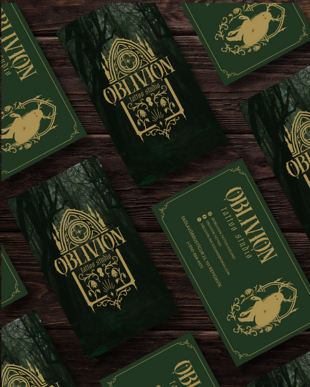
Tangible Assets
The business cards were designed with shimmering gold foil. Luxurious and memorable.
.png)

.png)
Of course, they needed a window decal as enchanting as their brand. When you have a physical location, pretty signage is a must! This was designed to call to the strange ones like a portal.

The Portal

